Hitachi Europe
Restructuring and redesigning Hitachi Europe
Hitachi Europe operates across Europe, Africa, and the Middle East, providing expertise in energy, transport, healthcare, public safety, R&D, and robotics. They have a vast online presence, operating 25 international sites, each with regional variations and multi-language functionality.
An existing client of ours, we had previously designed and developed their global sustainability page as well as provided support for their social innovation site. Hitachi EU approached us with their next project, replatforming, restructuring, and redesigning the network of their European websites.
Role
UX Researcher & Designer
Timeframe
1 year
Client
Hitachi Europe
Year
2022
THE CHALLENGE
Reinvention
The Hitachi EU (HEU) website was built on Drupal 7 - a platform that is due to reach its life’s end as of late 2023. As this is the case, the HEU site required a replatforming onto a new CMS. As part of this process, HEU requested a restructure and redesign of the existing site. The HEU site consisted of 25 countries and 28 languages, creating an intricate web of content. We were tasked with how to reduce and organize the content to create a more seamless user experience while overhauling the look and feel of the site.
My role in this project included conducting and analyzing user research, defining the user experience, and assisting in the application of the UI in collaboration with two other designers. In addition, I worked closely alongside our Project Manager and development team to develop solutions and define structure.

PART ONE
The Discovery
Understanding the Problem
THE DISCOVERY
We conducted a discovery phase to define project expectations and functional requirements. This phase allowed us to gain a deeper understanding of Hitachi EU’s current information architecture, review HEU’s existing experience, and ultimately agree upon the best solution for the new platform.
Requirement Gathering
We began the discovery phase by conducting a requirement-gathering workshop with Hitachi EU stakeholders. This allowed us to understand their current situation and establish clear strategic and functional objectives for the project.
From the outset, it was evident that stakeholders were dissatisfied with the existing experience, primarily due to navigation issues. Hitachi employees are the primary user group of the website and they heavily rely on the website for information, making intuitive navigation crucial. The site's illogical content hierarchy and mislabeled outbound calls to action caused frustration and hindered information retrieval, impacting internal stakeholders' productivity.
In addition, stakeholders felt that the overall design and content of the site failed to meet expectations. Clear messaging, brand recognition, and site maintenance were lacking, resulting in outdated pages alongside new ones, creating inconsistency.
Having addressed these concerns, we shifted our focus towards understanding Hitachi EU's vision for the website's future role.
“The website should serve as a landing page and online brochure for users, directing them to information and pages which relate to the more business-driven sites.”
HITACHI EU STAKEHOLDERS
If the website should serve as a directory, it needed an intuitive information architecture. Given the volume of content on HEU’s variety of websites, content needed to be clearly organized and presented in a manner that was easy to understand and navigate for users. We also needed to develop a solution to address the variety of regions and languages encompassed by HEU so that users from across the globe could locate and easily access relevant information.
If the website should serve as a brochure, it needed to clearly define and showcase Hitachi EU's identity and activities—an aspect lacking in its current state. This required communicating the company's message through compelling content and visuals, establishing a clear and recognizable brand identity consistent with HEU's messaging.
When discussing the desired look and feel going forward, there were three key ideas that stakeholders honed in on.
Balanced
The redesign of the website should have the right balance between content and visuals, creating an experience that is streamlined, consistent, and aligned with HEU’s brand.
Exciting
The redesign should be eye-catching, modern, and unique, while keeping accessibility in mind, creating a visually appealing experience for users that is as exciting and impressive as HEU’s business.
Engaging
By creating an experience with dynamic content, an exciting visual identity, and efficient navigation, we will encourage users to return and engage with the website on a frequent basis.
These findings provided the foundation and direction for our solutions, but first, we needed to dig a bit deeper into the structure and content.
UX & Content Audit
Moving into the next step of our discovery, I conducted a UX Audit of the existing site while HEU stakeholders conducted a content audit with the support of our SEO team.
The content audit allowed us to reduce and merge content, allowing us to streamline the information architecture and improve user journeys.
Concurrently, I performed a comprehensive UX Audit of HEU's desktop and mobile website, examining user journeys, identifying pain points, and benchmarking against competitors. The findings highlighted areas for improvement, elements to incorporate into the new HEU website, and opportunities to leverage successful benchmarks.
Analytics Review
In collaboration with the SEO team, we reviewed analytics for the existing EU site and regional sites. This allowed us to pinpoint the pages generating significant traffic as well as exit points so that we could optimize the information architecture to direct users to the appropriate information efficiently.
Card Sorting Workshop
Once we had a clear picture of the existing site and its structure, we conducted an open card-sorting exercise with HEU stakeholders. The aim of this workshop was to challenge HEU stakeholders’ thinking about how their current site is structured and to create an information architecture for the replatforming that meets users’ expectations and organizes content in a logical way.
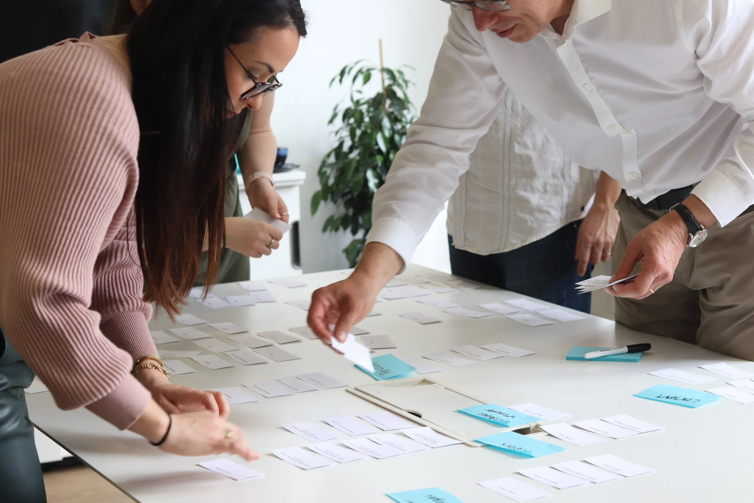
Based on the workshop findings, we established an information architecture framework that categorized content in alignment with user expectations, guiding them to their desired destinations.
A significant outcome of the workshop was the decision to overhaul the approach to country-specific content. It was determined that they would showcase only countries with substantial business operations and local offices, resulting in a streamlined website with simplified user journeys. This decision not only eased the workload for the communications teams but also reduced overall content and backend page management.
Hitachi EU needs to restructure and redesign their EU network of websites in order to effectively direct users to key information and increase engagement across the website.
PROBLEM STATEMENT
Building the Sitemap
As a result of our discovery activities, we were able to create the sitemap of the new and improved website. Our goal was to streamline the existing structure and establish straightforward and efficient user journeys. Here we were also able to delineate between three key areas of the site: European content, global content, and country-specific content.
With all of our discovery findings in mind and our sitemap as our guide, we moved into the second part of the project - design.
PART TWO
The Design
THE DESIGN
Reinventing Hitachi EU
We began our design phase with low-fidelity designs before moving into the creative application in UI designs.
Low-Fidelity Wireframes
There were three important considerations we took into low-fidelity wireframing based on the conversations we had during the discovery phase.
There needed to be a balance between content and visuals
Crosslinking and signposting were key to improving user journeys through the site
In order to allow internal stakeholders to have the simplified content management system they desired, we needed to prioritize the re-utilization of modules across pages to streamline the variety available to them and also facilitate consistency in design across the site.
This digital low-fidelity wireframing approach enables dynamic design, and we find the visuals help clients to understand the approach while maintaining the focus on the content hierarchy and flow. We provide clear annotations alongside the designs that clearly indicate the purpose of each section (module) including content, feature functionalities, calls to action, and cross-linking. This not only facilitates client review but also allows for smoother handover to UI design and developers.
UI Designs
From low fidelity we moved into UI design, bringing our concepts to life. This process presented unique challenges due to stringent brand guidelines mandated by Hitachi Global, requiring thorough verification of design decisions for compliance. Fortunately, our prior experience designing Hitachi's sustainability page proved invaluable, allowing us to leverage existing concepts while adding a personalized touch specific to Hitachi EU. The result was an engaging, balanced, and consistent design that effectively conveyed Hitachi EU's brand story while ensuring adherence to AA accessibility compliance standards.
PART THREE
The Result
A Brand New Hitachi EU
THE RESULT
After handing off to development and providing design support throughout the rest of the project, Hitachi Europe’s new website officially launched in February of 2023. You can view the full experience and visual design on their website: www.hitachi.eu/en/
Global Appreciation
Impressed by our successful collaboration with Hitachi EU, the Hitachi Global stakeholders expressed their enthusiasm to work with us as well in order to consolidate the corporate and regional web presence into a unified Hitachi.com website. Currently, the corporate platform spans 52 websites in 31 languages, while their Social Innovation site serves 17 regions in 10 languages. This consolidation project will be one of the biggest our agency has taken on to date.
View More
Mobile and web-based application with a bespoke content management system designed to improve school-to-parent communications.

Creating a dedicated microsite to support community members in the West of England in their career journeys.