
TomCom
Designing a school to parent communication portal
Thomas’s London Day Schools are one of the United Kingdom’s most prestigious independent educational institutions, based in the heart of London.
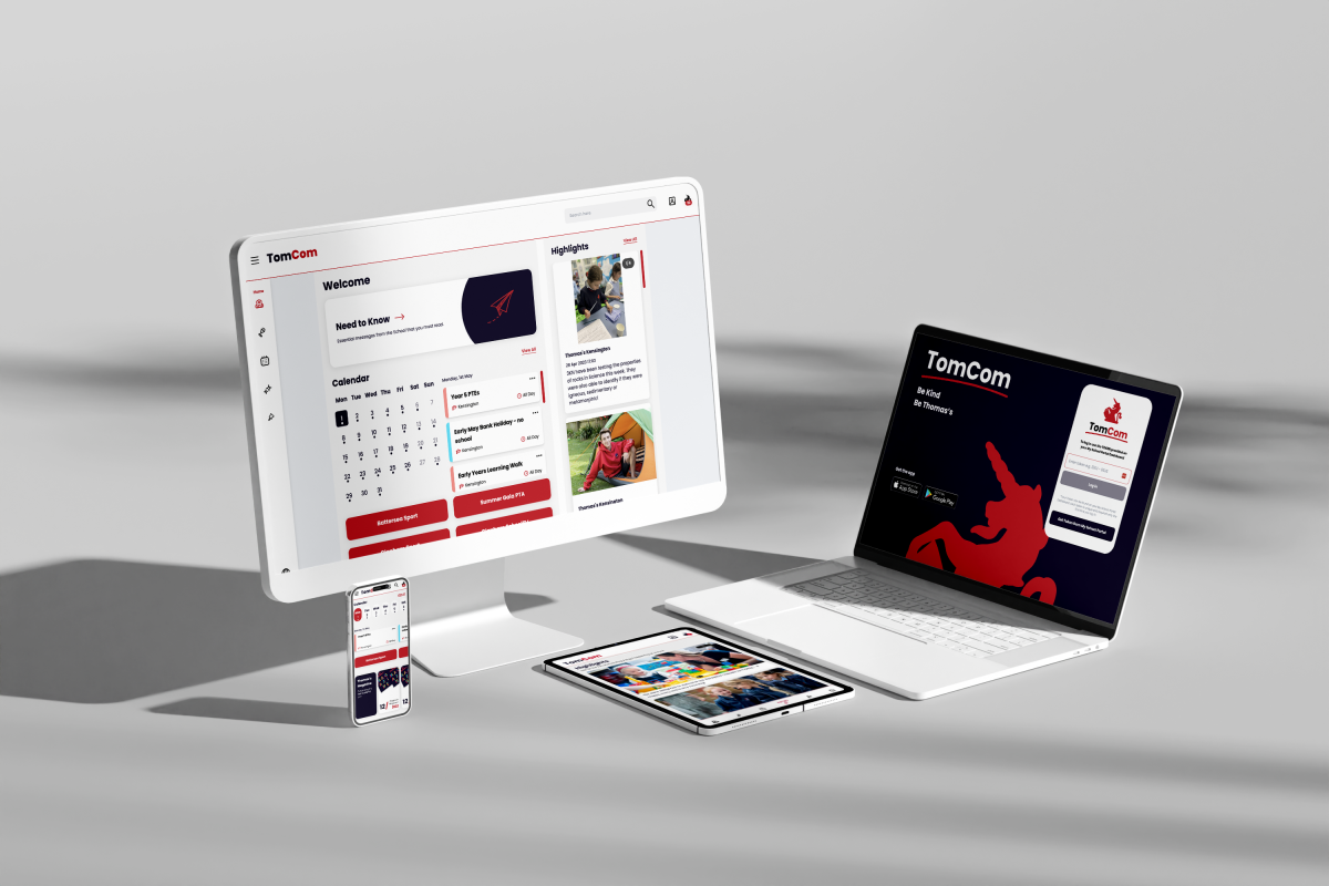
I was part of the ambitious project to reinvent and design the way Thomas’s communicated with their vast community of parents, students, benefactors, and staff. Ultimately, we delivered a mobile application complemented by a web-based application underpinned by a bespoke content management system (CMS).
Client
Thomas’s Schools
Year
2022
Role
UX Designer
Timeframe
8 months
Redefining Communication Channels
THE CHALLENGE
Thomas’s communication channels with parents were disjointed and ineffective, causing parents and guardians to miss important information regarding their students. Our goal was to create an online portal that streamlined each school's existing communication channels while accommodating a diverse range of content onto one platform for users.
My role was focused on defining the user experience and assisting in the application of the UI in collaboration with two other designers. In addition, I worked closely alongside our Project Manager/Business Analyst and Technical Lead to develop solutions and define structure.
Ultimately, we delivered a mobile application complemented by a web-based application all underpinned by a bespoke content management system. With a tight timeline of 8 months, we launched with the start of the school year in September 2022.

Lost in Translation
THE DISCOVERY
After Thomas’s approached us with their communication problems, we began by digging deeper into the problem. What content was being created and how was it being distributed? Where exactly was it going wrong? What all was getting lost? To answer these questions and more, we focused on two sides of the story: the perspective of Thomas’s staff and the perspective of Thomas’s parents and guardians.
Conducting Focus Groups
Parents are extremely busy. Time is something they always need and don’t often have, a point that was reiterated to us by Thomas’s parents during their focus group. When it came to staying on top of their children’s schedules and school life, parents needed it to be simple. They wanted to feel connected to their child’s life at school, and also ensure they knew what was going on and when.
From the focus group with Thomas’s staff, we found that they were struggling to compile and distribute content. They found information was getting overlooked, they often weren’t sure what type of content parents wanted to see, or how they should distribute it.
These insights highlighted two fundamental issues that formed the basis of our solution.
The Problem
THOMAS’S PARENTS
Need a centralized source of key information where they can stay up-to-date and connected to their child’s lives.
THOMAS’S STAFF
Need a simplified way to share content with parents in order to simplify their jobs and to ensure all important information is received.
Outlining the Solution
Based on the insights from our discovery, we came to the conclusion that the ideal solution would be a centralized communication platform housed on a mobile application.
This solution is reflective of today’s content consumption and provides ease of access to and notifications for important information. This mobile application would be supported by a responsive website application, allowing parents to access all of the same content in a larger format from their computers. The final layer was a bespoke content management system (CMS), ensuring that content was just as easy for staff to create.
We presented our findings along with the proposed features and initial wireframes of how the app might look and function. The visuals breathed life into the concept for the client, igniting their excitement and granting them a tangible understanding of how the application would benefit school life. They felt like this solution would not only functionally solve their problems, but also serve as a great marketing tool and serve to promote an even greater sense of community within the school. With their sign-off, we began working on one of the biggest projects our agency had taken on to date.

PART ONE
The Application
Introducing, TomCom
THE APPLICATION
This was the origin of Thomas’s Communication portal, officially known as TomCom.
Defining the Front End Features
From our discovery insights, we identified six core needs that parents had addressed. These needs translated into solutions that became the featured areas of the application.
1
USER NEED
The ability to locate and view key information at a glance
SOLUTION
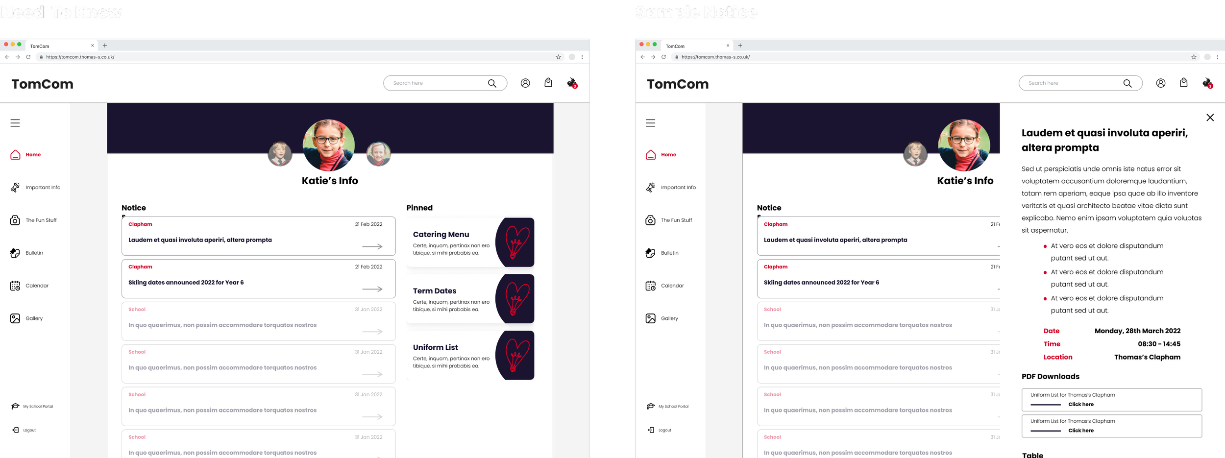
Dashboard containing a snapshot of the most recent, key information with quick access to all app features
2
USER NEED
Immediate alert of need to know information regarding the school and their student
SOLUTION
Push notifications and centralised hub of all important notices
3
USER NEED
The ability to stay on top of their children’s schedules
SOLUTION
Calendar containing all key events with the ability to filter by year level and event type as well add events to personal calendars
4
USER NEED
Staying up to date with everything that is going on at their student’s school
SOLUTION
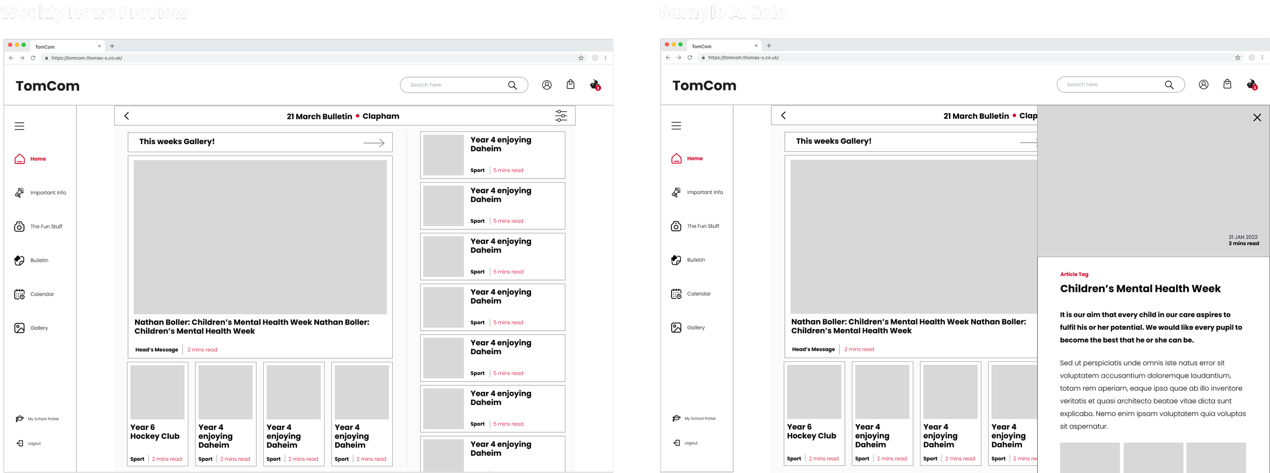
News and weekly messages from the headmaster about all of the things happening at each school
5
USER NEED
Feeling more connected to their child’s educational experience
SOLUTION
Instagram like feed of highlights so parents can see what their children are getting up to each day
6
USER NEED
Ease of access to their child’s class photos and everyday photography
SOLUTION
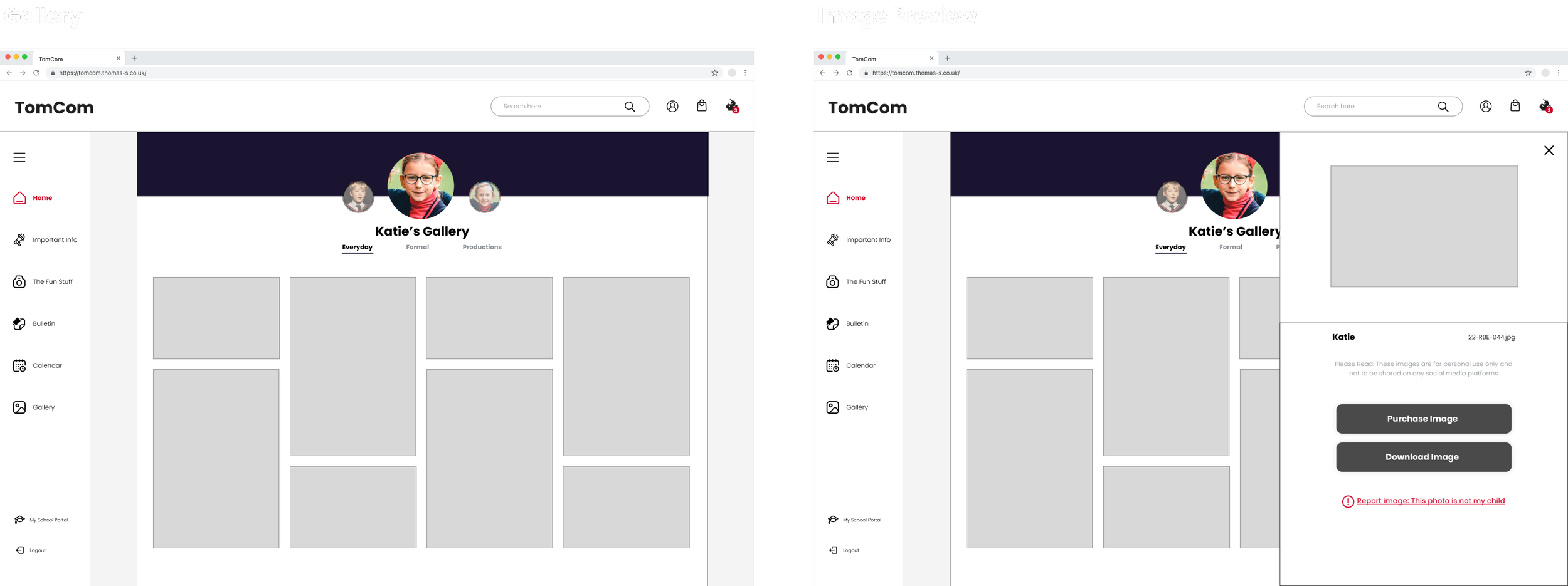
Gallery utilizing facial recognition software to provide parents access to their child’s class, everyday and school production photography
Intricate User Journeys
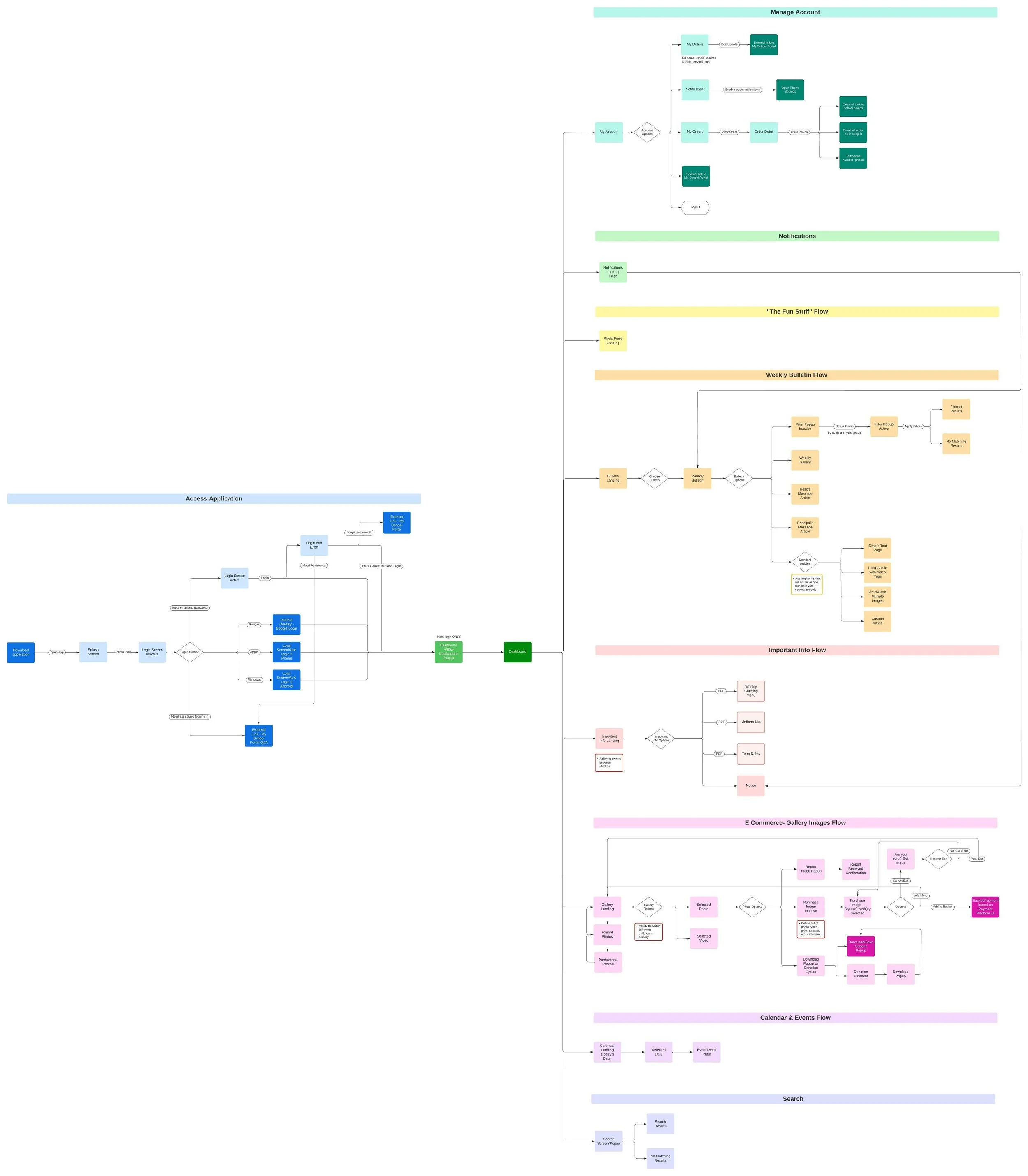
With these solutions in mind, we began mapping out our user journeys. While our initial focus was on parents and staff, the client later informed us that they would also like to provide “VIPs” (such as school benefactors) and older students access to the application. While this didn't significantly alter the application's overall functionality, it did add complexity to defining user journeys and information architecture.
This variety of users and their unique use cases proposed an interesting challenge. We had to implement profile switching based on user account types to avoid overlap for staff who were also parents, tailor available features to each user type to avoid presenting unnecessary or inappropriate content and implement front-end tagging for filtering and scannability. These considerations ensured a seamless and personalized experience for all users.
Parent User Flow

Wireframing
Once we had outlined the features and user journeys, we moved to the wireframing stage. As we had already done some mid-fidelity mockups for the client during the proposal that were well received and we were working on a very tight timeline, we decided not to work backward and started with those designs as our baseline.
Mobile First Design
We began designing our mobile application first, as this would be the primary access point to the product. By starting with the mobile design we were able to clearly prioritize the hierarchy of content on limited screen real estate as well as ensure we were creating simple, practical designs.


Web App Design
Once we had mobile designs established we moved on to the desktop application. While we did have more screen real estate to play with now, our main goal was to keep the experience as consistent as possible with the mobile application to ensure familiarity and a seamless transition between the two experiences. We also wanted to ensure that the desktop application still felt like a product, not a website.


UI Application
As Thomas’s was an existing client of ours and we had created their branding during their website redesign, it was simply a matter of adapting and applying their existing branding to the product. In the end, we were able to create a look and feel for the product that was entirely Thomas’s and served to not only work with the UX but enhance it.

PART TWO
Content Management System
Bespoke Content Management System
THE BACKEND
Simplifying and consolidating the way Thomas’s staff shared content was a key point of our discovery. All of Thomas’s staff was going to be uploading content and the vast majority had no experience using any type of content management system (CMS). Unfortunately, a lot of existing CMS platforms are not the most intuitive experiences. We knew that without a simple, easy-to-use CMS experience that TomCom would not reach its full potential, so we proposed that we design an entirely bespoke CMS for TomCom.
Creating Structure
While we wanted it to feel like a CMS, we didn’t want to feel constricted by how they were typically designed. We decided to start by mapping out the information architecture of the CMS to determine the best structure. We led with the following considerations:
Sections should be organized to reflect the front-end features for familiarity
The hierarchy should be based on the most frequently created content for efficiency
The dashboard should be customized to the user type
With these ideas in mind, we began outlining the architecture of our CMS.
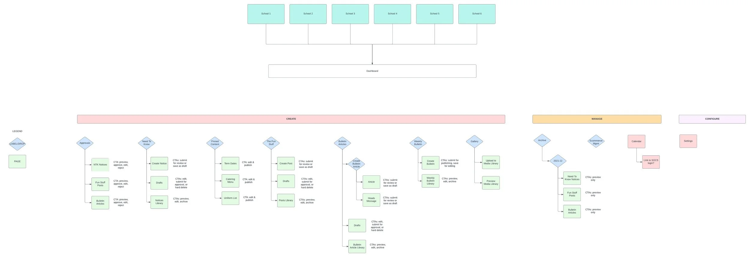
Another important consideration with the CMS that we spent time outlining was the approval flows and states for each content type. This ensured the necessary steps and validations were in place so that nothing was published without being properly vetted first.

Low Fidelity
Collaboration was key in defining the design of the CMS. As there was a multitude of functional and technical considerations for this design, I worked closely alongside our PM/BA and technical lead while brainstorming the best possible design. Their expertise was extremely valuable in helping us create a system that was not only intuitive for our users but functionally effective. Together we began sketching out initial concepts for our low-fidelity wireframes.

UI Designs
From our sketches, we moved straight into UI as we were working on a limited timeframe. Visually we wanted the experience to mimic that of a standard CMS, however, we still wanted it to feel bespoke to TomCom. The styling we applied to the CMS was similar to the front-end TomCom application in order to create a seamless, familiar experience for Thomas’s staff. With these designs, we provided annotations that clearly outlined the intended functionality so that there was clear alignment between all teams working on the product.


PART THREE
The Impact
Enhanced Communication & Strengthed Connections
THE IMPACT
The TomCom application has been extremely well received since the start of the 2022 school year. The application has been downloaded over 3,000 times and it has transformed the communication channel between Thomas’s parents and staff.
“Our TomCom app is now an essential part of school life, offering everything in one place, as well as offering parents a cherished window into what goes on in their child’s day-to-day life by means of what we call our ‘in-house Instagram’, using facial recognition to upload a daily bespoke gallery of professionally shot images.”
“The backend of TomCom is also designed in a way that is intuitive to use so that members of staff can build their own pages or send out a Need To Know notification after only a small amount of training.”
— Kate Thomas, Director of Marketing at Thomas’s London Day Schools
View More
Replatforming and redesigning Hitachi’s network of European websites.

Dedicated microsite supporting West of England community members in their career journeys.