

A health and wellness platform designed to improve the quality of life for those living with gastrointestinal diseases.

Background
Role: UX/UI Designer
Type: Academic Project
Time: 6 months
Tools: Figma, Optimal Workshop
Twenty million Americans suffer from chronic digestive diseases, and that number continues to rise. The effects of these diseases have some astonishing statistics. For example, more Americans are hospitalized with digestive diseases than any other condition, digestive diseases necessitate 25% of all surgical operations, and colorectal cancer is the 2nd leading cause of cancer death among American men and women.
Learning to live with one of these diseases can be exhausting and isolating and can have significant implications on someone’s quality of life. It becomes a constant factor in everyday decisions and it is a topic that can be uncomfortable to discuss. So how can we give these people their life back?
DISCOVER
Competitor Analysis
I began my research by analyzing potential competitors and quickly realized that there are not a lot of platforms dedicated to gastrointestinal (GI) patients. The applications that did exist typically only had a singular focus: diagnostics, tracking symptoms, or connecting patients with providers.
I knew I didn’t want to create a platform that was centered around diagnostics, but one that dealt with the aftermath of the diagnosis where patients are often left afraid and confused. I also noticed that platforms that provided symptom tracking often failed to provide useful insights from the data. The interpretation was typically left up to the user unless they shared their data with their doctor.
To set my product apart, I knew I needed to create a safe space where GI patients could learn about their disease in a way that was easy to understand, monitor their symptoms and access meaningful analyses, as well as store all of their personal health information, all in one place.
Survey
Before beginning user interviews, I wanted to get to know my target users by sending out a survey in order to better understand if and how GI diseases impact quality of life. I reached 134 participants through my personal network as well as connecting with GI patients through Facebook support groups. These participants were from a variety of age groups and had been living with their GI diseases for varying lengths of time.
93% of GI patients surveyed found that their disease has negatively impacted their quality of life
When it came to disease management, two different preferences driven by two different groups of users emerged
Those with GI diseases like Crohn’s Disease or Irritable Bowel Syndrome (IBS) were interested in tracking their symptoms
VS.
Those with Celiac Disease desired help locating restaurants that could accommodate their dietary restrictions
The results of this survey led to a deeper understanding of GI patient attitudes and desires, allowing me to make sure I was asking the right questions in my interviews.
Interviews
Interviews were conducted with three target users to discuss their attitudes surrounding their GI diseases and how it has impacted their quality of life. Results were affinity mapped and assigned to clusters.
The following four key insights emerged as a result
1
Fear and uncertainty surrounding initial diagnosis
2
There is a lot to keep track of when monitoring GI health
3
Diet is a constant source of stress and struggle
4
Desire to understand cause and effect when it comes to lifestyle and health
By triangulating my survey data with my interview questions I was able to perform a more meaningful analysis of my target users so I could ensure that I understood their problem, and addressed it appropriately.
DEFINE
The Problem
People living with gastrointestinal diseases need a way to better monitor and understand their health because GI diseases can severely diminish their quality of life.
After analyzing the research and defining the problem, I made the decision to focus on
Symptom Tracking & Disease Education
I realized that this platform needed to be tailored to a user’s specific diagnosis to provide them with not only a way to track their symptoms, but a way to help them better understand their disease and learn how to manage it.
Given the time and resource restraints, symptom tracking was prioritized over a restaurant feature as it provides value for a wider group of the GI disease community. It was decided that a restaurant feature would be readdressed at a later date with the possibility of being a value add for users or an entirely new opportunity.
Personas
Two personas were created based on the two different types of users anticipated. These personas served as the guide for all decisions made throughout the entire process to ensure the user’s needs were being kept in mind.
The newly diagnosed patient dealing with the emotions and uncertainty surrounding their diagnosis
The data-driven patient who wants to better understand the cause and effect between his disease and his lifestyle
IDEATE
User Flows
Based on these personas I developed the key flows that each type of user would move through in order to achieve their goal.
“As a newly diagnosed GI patient, I want a way to better understand my diagnosis and what it means for my life so that I can learn how to manage it and find my new normal.”
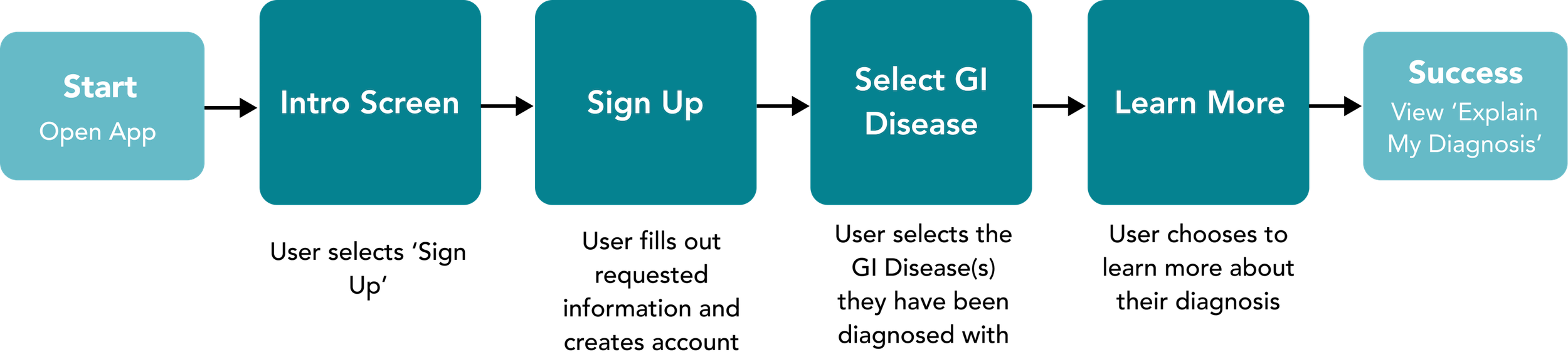
“As a data-driven patient, I want a way to be able to track my diet, symptoms, and lifestyle so that I can share data with my doctor and make sure I am living the healthiest lifestyle for my GI disease.”

Sitemap
Using the user flows as a guide, an initial sitemap was developed to provide a framework for the navigation structure. The sitemap was refined during the course of multiple iterations involving an open card sort, user testing, and feedback from other designers. The final sitemap is as follows.
DESIGN
Sketching & Wireframes
In sketching initial wireframes my goal was to keep the application as simple as it could be. The key was to make life easier for users, not complicate it. When developing the core tracking feature I wanted to remove as much user effort as possible, so users are only required to type in very limited capacities. Most interaction is limited to the touch of a button.
After laying this out, I digitized my sketches in Figma and created a prototype to be used in testing.
TEST
Usability Testing
Usability testing was conducted with seven participants both in-person and remotely. The goal of the test was to assess the learnability of the application for new users as well as observe how users understand the benefits of the application for health and wellness management.
7 test participants
3 currently diagnosed with GI diseases
2 with a medical background
2 with no diagnosis and no medical background
The purpose of this variety in the participants was to see how the experience might differ for those who have been living with GI diseases compared to someone who might be newly diagnosed and searching for resources. The medical background was desirable to see how they interpreted the features and benefits of the application based on their professional experience.
The results of the testing were affinity mapped and assigned to clusters in order to identify key information to improve the design.
Using a rainbow spreadsheet to further analyze results, the key issues were identified, prioritized, and addressed.
Enhancements
Cleaner Interactions
Checkboxes were enlarged or replaced with chips for easier selection, and scrolling was removed when possible so it was easy to identify continuity buttons
Improved Flexibility
Top navigation bars with the exit and/or back buttons that will stay locked in place have been included so that as users scroll they are always able to exit
Addressed Privacy Concerns
Users will now be informed as to why personal health information is being requested so they feel more comfortable sharing
Improved Clarity
‘Your Recommendations’ was clarified to ‘Recommendations For You’ so users would understand that these are personally generated for them by the application
Preference Testing
Two different versions of the introduction screen were preference tested with 16 participants. The goal of this test was to determine which design made a better first impression on users. After all, you never get a second chance to make a first impression!
94% of participants selected the redesign for its simplicity, clarity, and balance.

DELIVER
Style Guide

Poppins was chosen due to its casual, clean feel and clear readability. It also offers a variety of weights making it easy to adapt copy for both body and headings.
Primary Brand Colors
These varying shades of blue/green represent the band’s primary colors for their calm and clean appeal. Tones of these three core colors were applied throughout.

Features
The final high-fidelity prototype was developed after multiple iterations based on the results of testing and feedback. The 8-point grid was utilized and maintained throughout. The four key features are highlighted below. With this platform, users can manage their disease all in one place. They can store their health information, monitor their symptoms, understand their disease, stay up to date on research, and in turn, improve their quality of life.
Personal Health Information
Symptom Tracking
Disease Education
Research
Prototype
LOOKING FORWARD
As this was a school project, this was the final iteration of my design. However, if I was to move forward with this project I would proceed with the following.
Additional testing and iterations
Usability testing was originally performed on the mid-fidelity prototype in order to test the functionality and learnability of the platform. The next round of testing would be completed using the high-fidelity prototype to further test the functionality of the application and to see how users interpreted the overall feel of the application. These results would be further analyzed and implemented into the design in additional iterations.
Handoff to development
While a development team was not part of this project, in a real working environment I would be in communication with the developers from the earliest relevant stages to make sure there was a clear understanding of what we were creating.
If I were to connect with developers at this point in the project, I would walk them through the design process to make sure they understand what we are creating. Based on their feedback any additional iterations would be created. After establishing how they would like to receive everything, I would provide organized files, a clickable working prototype that demonstrates functionality, as well as thorough and descriptive documentation.
Future Considerations
Based on the strong desire from the Celiac community for a restaurant feature, I would like to eventually revisit this idea. If it was deemed a reasonable and valuable addition to the application, I would love to begin the design process.
View More
Mobile and web-based application with a bespoke content management system designed to improve school-to-parent communications.

Replatforming and redesigning Hitachi’s network of European websites.
